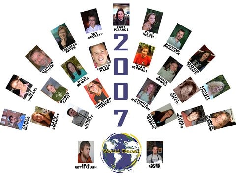
Heyo all
I am working on a world race poster as a possible fund raiser and Seth mentioned I should share what I have so far with you to get your thoughts about it. Just a gut reaction would do, or drill me I don’t care. I am looking for reasonable ways of improving the concept, the style is less of an issue at this point. The type does look ruff in this stage, but the color should clean it up, but it is a ruff style as well. Didn’t I read that one or two of you are graphic designers?
Here is what it says because you can’t read all of it from the picture:
JAN-NOV 2007
A race against time, against odds, to really discover who God intended us to be and what he intended us to do. It is the race of our lives.
Guy leapfrogging the world
Central America, Asia, Middle East, Europe, Africa
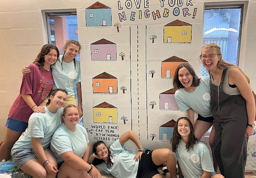
Seven teams sharing in one mission
THE WORLD RACE
The left paragraph is 1 Corinth 24-27
The right paragraph says
www.theworldrace.org
www.adventures.org
illustration and design by eric retterbush
for more information email at [email protected]
more art at www.xanga.com/worldraceart
all proceeds benefit the 2007 world race
let a guy know